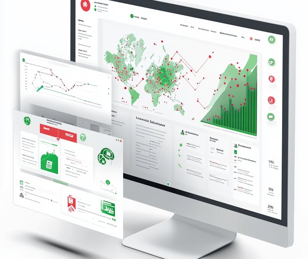
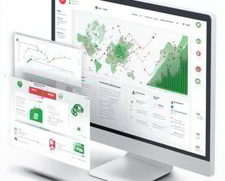
POWER BI : SALES PERFORMANCE DASHBOARD
An interactive Power BI dashboard designed to analyze sales trends, monitor KPIs, and uncover business insights across regions, time, and product lines — powered by dynamic filters and DAX intelligence
Project Overview
This dashboard was created using simulated regional sales data combined from multiple Excel/CSV files. It’s tailored to support sales managers and leadership in answering critical business questions like:
Which regions are underperforming this quarter?
What’s the YoY revenue growth for each product category?
How do discounts correlate with profitability?
Can I drill into a specific market or customer segment for deeper insights?
Objective
To build a professional-grade Power BI dashboard that empowers business stakeholders to track sales performance, evaluate product trends, and assess growth across time and geography — all through an intuitive, self-service analytics interface.
Business Value and Real-World Scope
This dashboard not only delivers visibility into current performance but also helps identify key revenue drivers, uncover margin leakages, and support decision-making for promotions, pricing, and regional strategy.
Whether you're a sales analyst, business leader, or data enthusiast — this project showcases how data storytelling and visual analytics can bridge the gap between numbers and action.
Power BI (Desktop + Service)
Power Query for ETL (data merge, cleaning, transformation)
DAX for advanced metrics
Excel for base dataset simulation
Tools & Technologies Used
Key Features
KPI Summary Cards:
Instantly view total revenue, MoM/YoY growth, average order value, and profit margin trends.Time-Series Trends:
Interactive visuals to compare month-over-month and year-over-year performance using custom DAX measures.Category-Wise Breakdown:
Track sales by product segments, sub-categories, and countries with dynamic bar and line charts.Geo-Regional Insights:
Interactive map visuals to highlight top-performing regions and identify low-performing zones.Drill-through Navigation:
Click on a category or country to drill into deeper metrics — enabling micro-analysis from a macro dashboard.Smart Filtering:
Multi-level filters to slice the data by segment, region, date, and product line for customized views.
DAX Measures
Total Sales: Sum of all transaction values; this is a core revenue KPI.
Total Profit: Represents total profit generated (typically Sales minus Cost).
Total Orders: Count of unique order IDs, reflecting overall volume of transactions.
Profit Margin: Calculated as (Total Profit ÷ Total Sales) × 100; shows profitability percentage.
Sales Growth %: Percentage increase or decrease in sales over time, often Year-over-Year or Month-over-Month.
Sales Growth: The actual numeric difference in sales compared to the previous period.
Sales by Year: Tracks the trend of sales across multiple years for historical comparison.
Previous Year Sales: Total sales from the previous year, used in growth calculations.
Sales Achievement %: Indicates how much of the sales target has been achieved — (Sales ÷ Target) × 100.
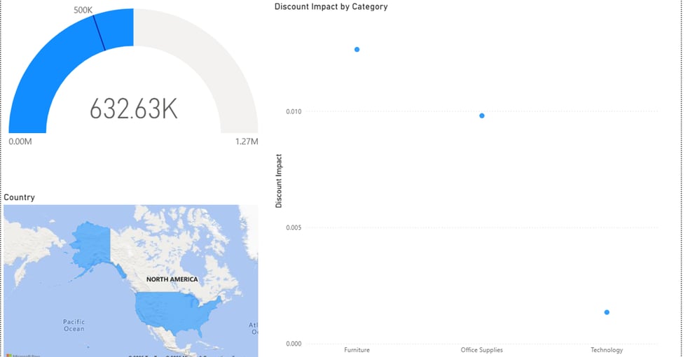
Target Sales: The set benchmark for sales performance; visualized using gauges or progress charts.
Discount Impact: Shows how discounts affected profitability across different product categories.
Recency: Measures how recently a transaction occurred; useful for customer engagement tracking.
Measure: A custom or placeholder measure used for internal calculations or testing (can be renamed for clarity).
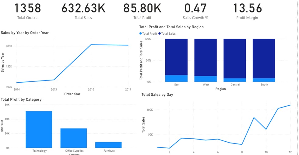
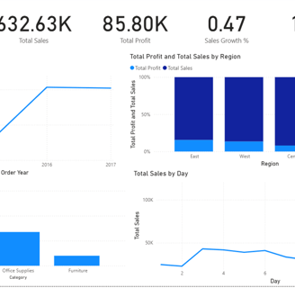
The dashboard includes several clear and business-focused visualizations:
KPI Tiles: Display key figures such as Total Sales, Orders, Profit, Growth %, and Margin at a glance.
Sales by Year: Line chart showing historical sales growth and identifying peak performance years.
Sales & Profit by Region: Stacked bar chart comparing geographic performance and profitability.
Sales by Day: Line chart that reveals daily sales fluctuations and buying patterns.
Profit by Category: Bar chart to evaluate which product categories contribute most to profit.
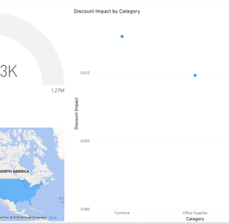
Discount Impact Analysis: Scatter plot assessing the effect of discounts on different categories.
Sales vs Target (Gauge Chart): Visual tracker for how current performance stacks up against predefined targets.
Geographic Map: Highlights sales distribution by country/region to support regional strategy.
Dashboard Visuals & Explanation
Conclusion
This dashboard is designed not just for analytics, but for decision support. By combining KPIs, trend analysis, profitability breakdowns, and sales target comparisons, it enables business leaders to:
Identify top-performing regions and categories
Pinpoint areas where discounts hurt profitability
Monitor growth trends over time and optimize resource allocation
Evaluate how close they are to meeting targets and adjust strategies dynamically
The use of DAX adds powerful custom logic, making the dashboard interactive, dynamic, and highly business-relevant — ideal for both executive reporting and hands-on operational planning.
GitHub Repository
Want to dive deeper into how this project actually works?
We’ve made the complete codebase and resources available for you on GitHub
👉 Access the full repository here:
Connect
Join us in shaping the future of leadership.
Innovate
contact@youlead.com
© 2025. All rights reserved.